The new visual identity for Fidelity Bank a full-fledged commercial bank operating in Nigeria, with over 5 million customers who are serviced across its 250 business offices and various other digital banking channels.
Development of new visual identity for the bank to run across all media
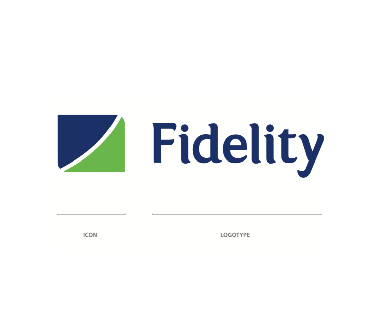
Primary Identity
The Fidelity icon represents two arrow tips. The blue arrow conveys our rich and conservative heritage, our respectful nature and our maturity. The blue speaks of the fact that the brand will never forget its roots. The green arrow, however, represents the brands vibrancy and youthfulness. The icon in its totality is indicative of a positive, bright and world class future.
The logo consists of two elements. The first being the icon and the second being the logotype. Combined, these elements, make up the backbone of the Fidelity identity. The logo signifies the banks image and its futuristic outlook. The identity conveys the quality service the bank offers to the public.
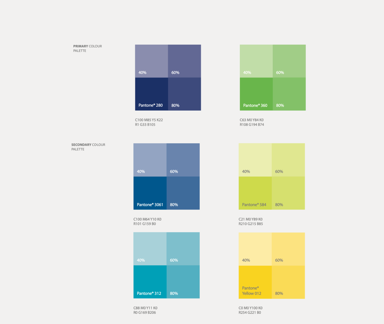
Colours
The colours that have been selected to represent the Fidelity Bank brand are Pantone® 280 (Fidelity blue) and Pantone® 360 (Fidelity green).
The secondary colours selected are as follows; The Secondary blue and light blue are Pantone® 3061 and Pantone® 312. The secondary green and yellow are Pantone® 584 and Pantone® Yellow 012.
These colour breakdowns must be followed exactly to ensure the consistency of the Fidelity Bank brand.
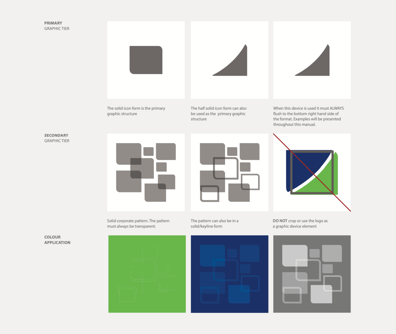
Graphic Device
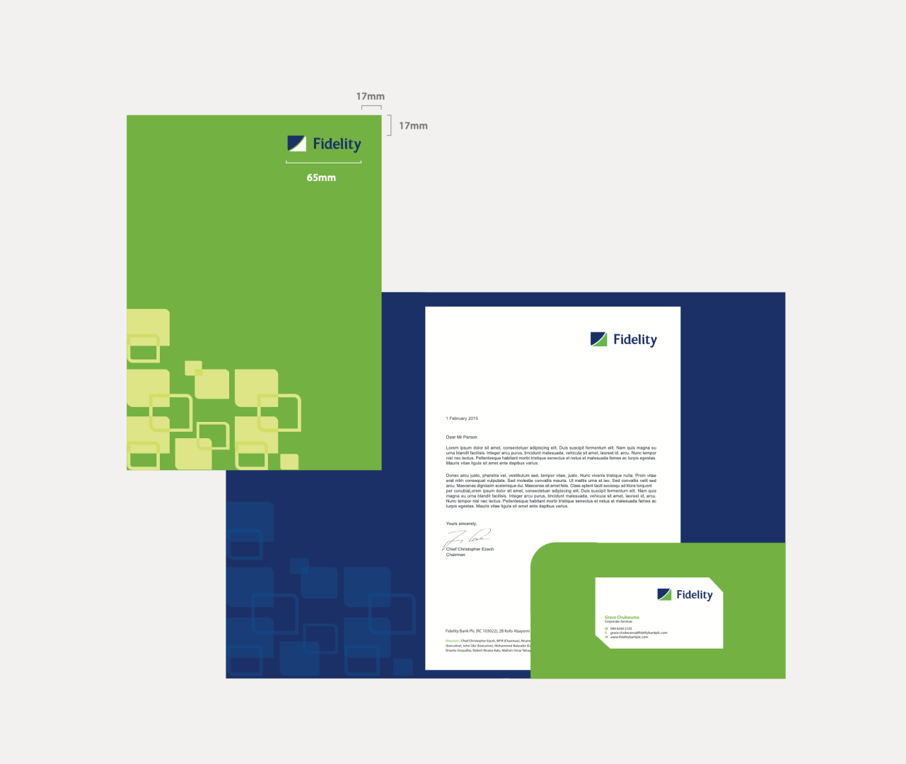
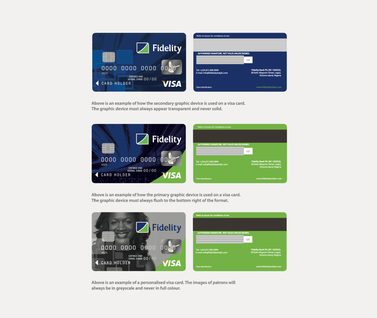
The graphic device has been generated from the icon. The shape can be used as a holding shape in its solid form. The lower left hand side of the icon can also be used as a secondary graphic device.
The second tier of the graphic device allows it to function as a repeat corporate pattern. The pattern overlaps and can be used in a solid form. The pattern can also be applied as a hybrid of both solid and keyline shapes.
The primary colour palette may be applied to the patterns. Only the colours used in the example may be used on the corporate pattern.
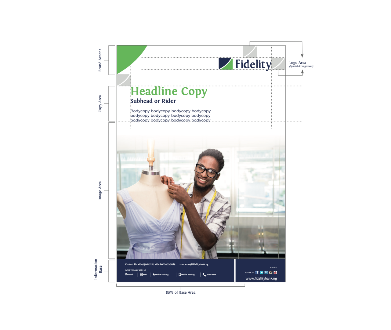
Advertising Template
On marketing material the Fidelity Bank logo should always be right aligned. The clear space rule defined on page 6 should always be applied.
The graphic device at the bottom of the format has been allocated for content. The device can move up and down depending on the amount of information that has to be featured.
When co-branding is involved the other identities will always feature at the bottom of the format.