Quickteller. A Super App.

Overview

Quickteller  is a financial services platform that allows individuals to make everyday payment needs via a digital application. Users can pay for bills from a wide range of billers, buy airtime for themselves, friends or family, send money via interbank or peer-to-peer transfers and manage their wallet with different payment instruments.

DOWNLOAD APP
 🡒

My role

Strategy User research Product design

Platforms

iOS Android

Year

2017-2019

The challenge

Ease of use

The goal is to redesign the Quickteller mobile app for customers to pay bills, transfer funds globally and buy airtime efficiently and hassle-free.

User Research

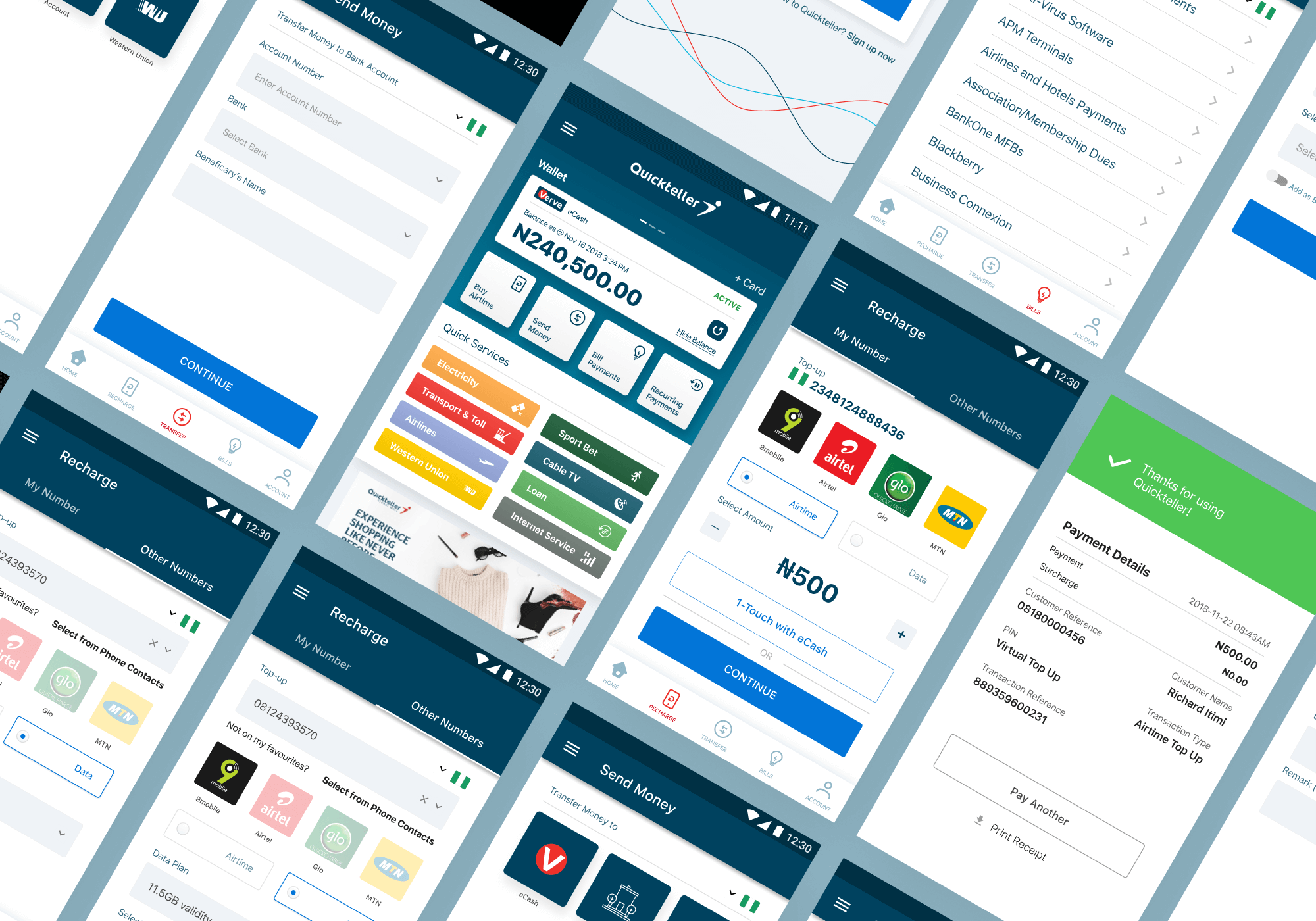
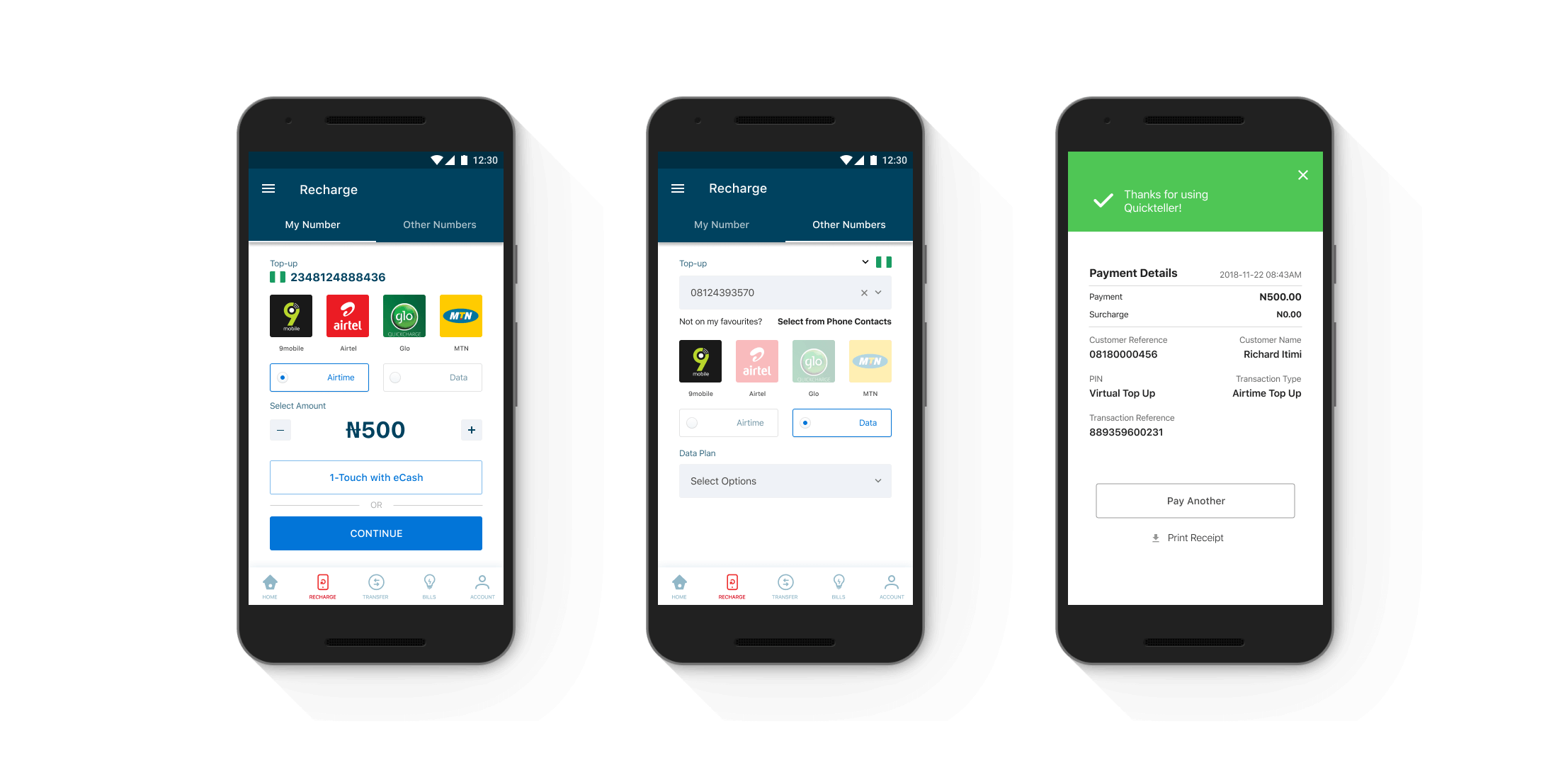
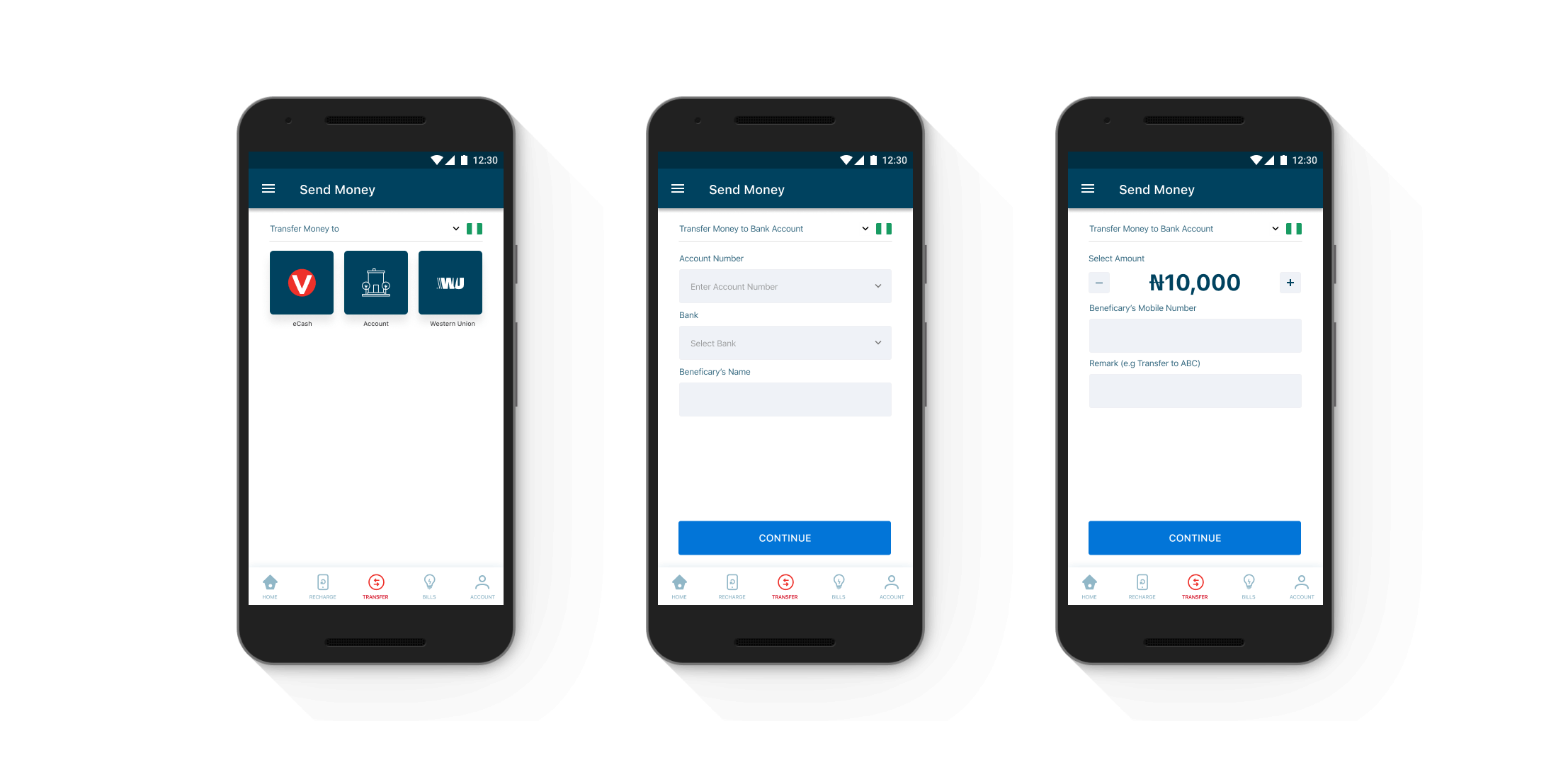
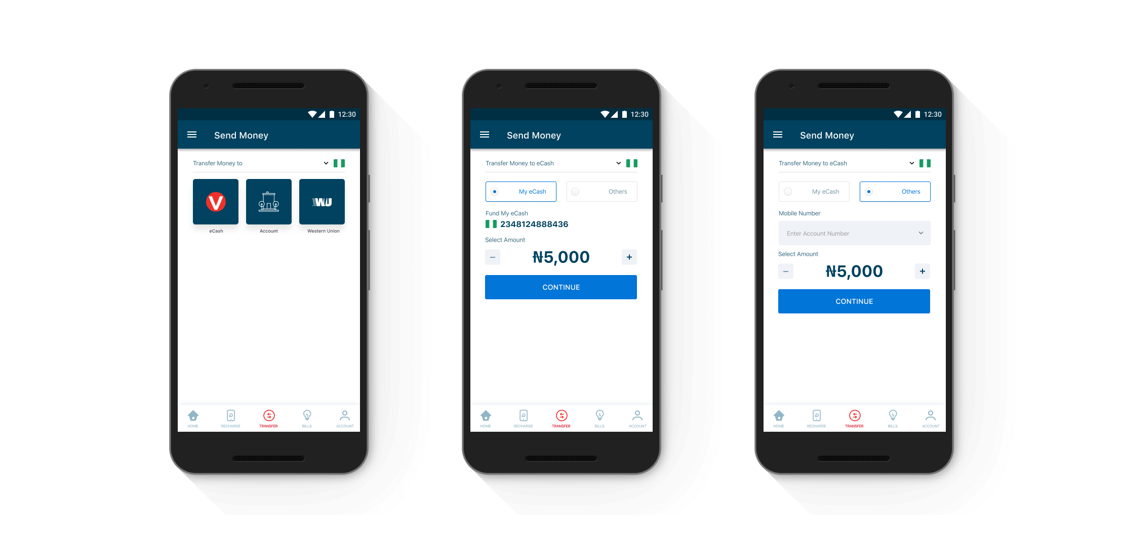
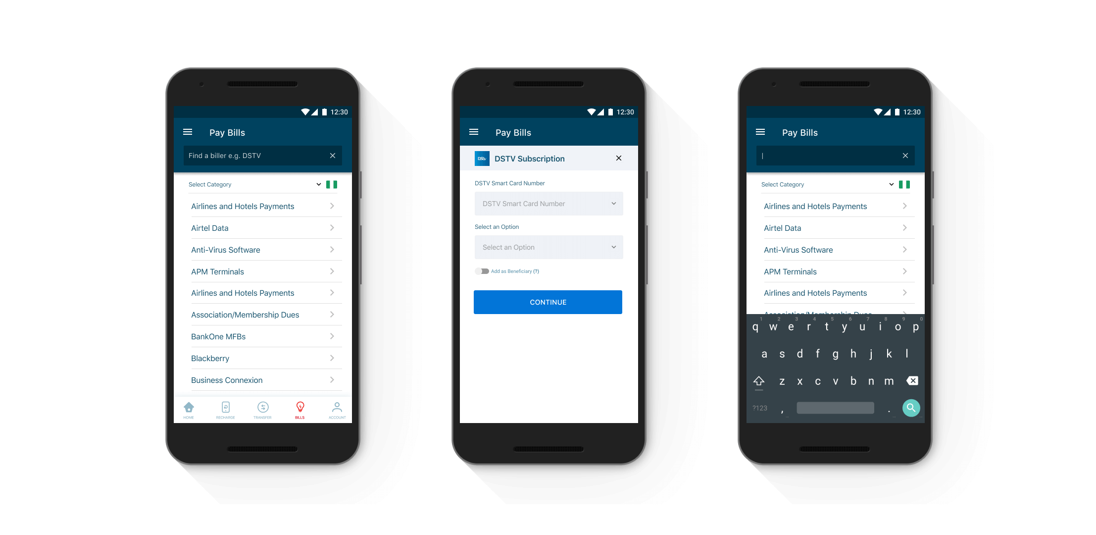
Data revealed that Quickteller mobile app users found it better to complete transactions on the web app. We also observed that people who initiated their sign up process on mobile do not activate their accounts. They have to complete their account activation on the web app. Weird!


How can we offer more profound and more insightful content in a simplified manner for users to promote more robust user engagement and retention?


To further assess our thesis, we needed to evaluate Quickteller through user and market research to discover opportunities for improvement.


We wanted to understand the reasons for churn. So we carried out Qualitative user research to understand their motives and empathize with them in our new designs.


The respondent selection was aimed at solely collecting feedback from current Payment App users. We selected this cohort of users because we felt they would provide the most accurate insights into what users want from a payment application and become less engaged with an app in their customer lifecycle. After conducting selective user interviews, we built a collective list of trends mentioned throughout user interviews.


Quickteller ’s most significant competitor within a reasonable margin are the Banks. The most noticeable difference between Quickteller and every mobile bank app is that Quickteller serves everyone, but the banks serve only their customers.


While both Quickteller and Nigerian banks offer similar content, Quickteller has still managed to reach and retain a more significant number of users. Quickteller has found a way to welcome every customer from every bank with one single goal — ease of use!

Requirements

Considering the very basic user needs to use the app and increase the amount of transactions through the app we ended up with this requirement list:

Design

The visual design of Quickteller leverages the trust factor from the parent company Interswitch’s branding in terms of the colors used. In addition to this, the Design of Quickteller is such that the user is always guided throughout using micro-interactions, walkthrough, and colorful interfaces. 

The typeface we designed with San Francisco as the system font for iOS and Roboto for Android. which is quite easy to read. The typography has been picked keeping in mind the heavy mobile usage and also ensuring good quality on lower end phones too.

Gradients have been introduced for a fresh look-and-feel. Customized illustrations have played a very important role in conveying the meaning of complex financial terms to users. It is through these that the user can understand and identify sections of the app better. 

No items found.

Design

All these insights centered around one fundamental truth that Quickteller seemed to be ignoring: people don’t want to spend time browsing through their wallet app. People want a tool that gets the job done as seamlessly and quickly as possible.

As I detailed every observation, I began to develop a user flow model that tracked common journeys taken within the app. 

To visualize my findings and organize what I found to be the most widely-used features, I attempted to model the user journey under the simplest hierarchal structure possible. This was broken down into the core features people actually opened the app for. My takeaway? The Home screen should guide users towards relevant features thereby making it easier to accomplish tasks. 

No items found.

Transactions

No items found.

Process

Outcome

Based on these wireframes and team collaboration, we created a task sequence based on the multiple proposed solutions that would highlight the new features and their integration with existing content.

After performing usability testing on the initial designs, we gathered user feedback on overall functionality, design, and examined the user’s ability to complete tasks in the sequence prototype.

We incorporated the feedback we received and re-created several iterations of the designs and task sequence. The final prototype highlighted the new solutions and how their integration into the app would complement existing designs and user process flow.

I’m really proud of how the team was agile and cooperative even in the face of additional requirements sneaking in last minute. Maintaining communication with the developers from start to finish ensured that we were able to stay one step ahead of implementation challenges, should there be any, and we never had any surprise feedback from the product managers, since they were in the loop every step of the way.

What I learnt :

Never start design process until you get all business requirements
Always review with the team at every phase to get an idea of feasibility.
Never jump in the visual design until you happy with how your prototype works.

For confidentiality reasons I have omitted the actual values for these metrics.
DOWNLOAD APP
 🡒

For work inquiries, collaboration or feedback

Reach out oladimejitolu@gmail.com and we can chat more.